There's a lot of buzz regarding the new Sibley Guide to Birds that was released yesterday. This post won't be so much of a formal review as just a collection of photos I took with my phone this morning.
A lot of the hype has been about the darkness of the reds. Here's a comparison with the new edition on the left and the old edition on the right:

Thoughts? Is the new one too dark? Or is the 1st edition too washed out? Or both? Most people agree that many of the plates are much too dark.
The Nature Travel Network review, by Brooke McDonald, can be seen here. In response to this complaint, Sibley responded with:
"There is a fairly dramatic contrast between the colors of the first and second editions. I would describe the new printing as rich, deep colors and excellent detail, on bright white paper, and the first edition actually looks washed-out in comparison. It's possible that some will find the new colors too dark, or it may just take some getting-used-to after using the first editions for years."So there you have it... just get used to it. Anyway, you'll also notice he changed the font and removed the little guide-lines (like the ones pointing to the gray bill and brilliant red).
Most of the artwork is the same, just slightly enlarged. However, he has reworked many spreads including the bluebirds:

And to be honest, I feel like the blues on the Eastern & Western are noticeably too dark here, ESPECIALLY on the Western Bluebird (which is hard to see in this picture).
I was fairly impressed with his reworked spread of finches. I like the improvements here:


Yay for Humboldt County birders:

Rare swifts now have a page; here Common Swift on the left and Fork-tailed Swift on the right:


I found some insight though. In an interview with Birdwatching Daily (which you can read here), he was asked what was the hardest thing about revising the book. He responded:
"Trying to blend the new work with the old. The original paintings were done in one marathon session about five years long. There’s a difference between the earliest and latest work in that time, but my style, the colors I used, and the flow of the work were unified.
It’s been almost 15 years since I finished those paintings. My painting style has changed, the colors on my palette have changed, my eyesight has changed, and so much more, but I was still trying to create new paintings that would blend with the old ones, and I was doing a relatively small number of new paintings in small batches, not the continuous stream of work week after week that I did for the first guide.
It was an impossible task: I couldn’t really match the old paintings. When the new ones didn’t quite match, I was faced with a choice — revise the old ones to try to bring them closer to the new, revise the new ones, or just let them be different. I think I chose each of these options at different times, and, hopefully, the contrast of styles won’t be a distraction to readers."
But yeah, I think it's noticeable. For example, this Fork-tailed Swift just lacks the super fine details:

Here are some mixes of rare species (on the ABA checklist) together with some NOT on the checklist:


Hey, now that the book is slightly bigger in dimensions, you notice the blank white space a lot more. I just scribbled all around in it to calm my nerves and make it feel more busy:

Speaking of blank space, why is the Nutmeg Mannikin illustration so small? I mean, it could be twice as big:

... and the miracle whips:

It's been a while since these have been split and renamed:

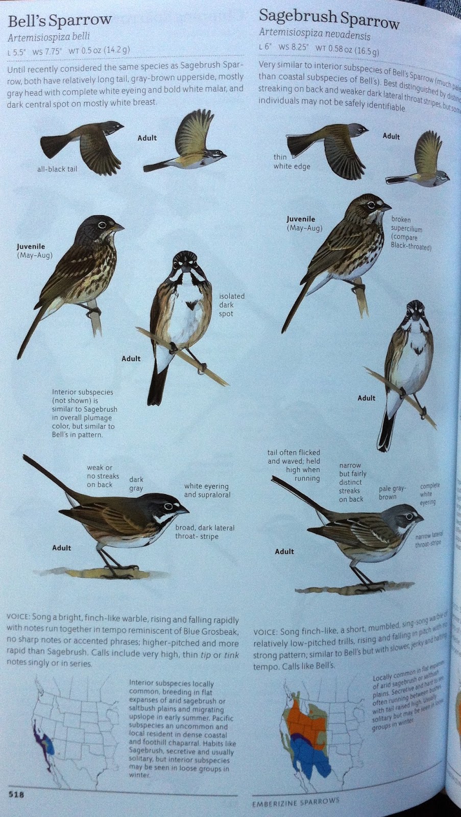
Probably the biggest disappointment for me, besides the darkness issue, is that Sibley continues to leave out the scientific names of subspecies. Instead he just calls them generic things like "Red" or "Sooty" and sometimes he just makes up his own names. At least he included separate maps for some of the obvious subspecies:


For some random species, he added little illustrations at the top of flying flocks:

Speaking about the tops of pages, he included some new "flying-away" illustrations:

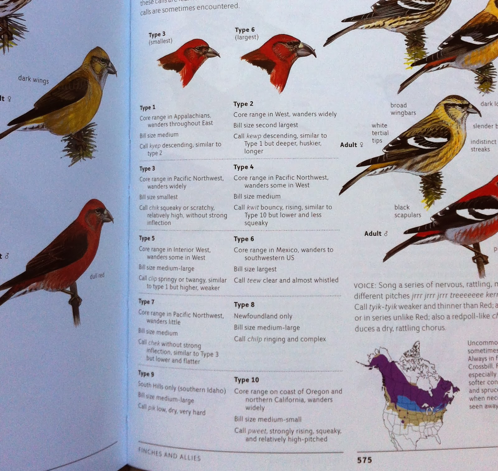
Red Crossbills get a little more coverage but what I'd really like to see are separate range maps of crossbill types:
If you're a beginner and enjoy checking boxes, the checklist in the back of the book should tickle your innards:

Range maps, which were done by Paul Lehman, are more zoomed-in to a regional level.... sometimes (he could afford to zoom in more on things like Baird's Sparrows). Here's the map for the Purple Swamphen:

Check out the super sweet range map of Cackling Goose though!

Oh wait, that's the map from the newest National Geographic book, NOT the newest Sibley. Here's the Cackling Goose map from the newest Sibley:

Now tell me, which map would you rather look at? I might add that the Sibley map is 1.5" from lower left to upper right... whereas the Nat. Geo. map is 5.5"!
You'll also notice, NO GREEN DOTS in any of the Sibley range maps anymore. I understand it would be quite an undertaking to include accurate dots of records... BUT I WANT THAT, NOT THIS:

Some of the spreads are not very neatly organized (understandable when you're combining multiple races of one species, multiple types of hybrids, a domestic, along with the heads of 2 other rare species):

You'll notice some new additions here and there like this illustration of tern bills:

But man, some of the illustrations don't impress me.... like this Least Tern:

Pigeons, oh, pigeons:

Yuck pigeon! And I mean the detail of this artwork, not the actual pigeon:

Sibley adds some new details about owling, as you can see below:

Um... the correct spacing is "Le Conte's Sparrow", not "LeConte's Sparrow". I know, I know, it's not a big deal to most of you, I understand, but I immediately noticed the error on page 522.
Personally, I'd axe the below text and add more hummingbird hybrid illustrations... namely Costa's X Lucifer:
